
How to Format a Self-Published Children's Book
Reaching young minds requires designing your children's book with intention and vision.
by Roe Pressley
DocuCopies.com
If you're in the early stages of self-publishing a children's book, the formatting decisions ahead of you matter more than you might expect. Unlike adult books, a children's book lives or dies on its visual and tactile experience — page size, paper weight, type size, even the roundness of a corner all shape how a child interacts with your story.
This guide walks you through every formatting decision you'll need to make, from page size to finishing touches, so your book arrives exactly the way you imagined it.
Full Color is a Must, Not a Luxury
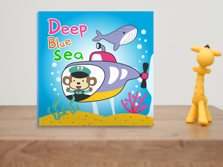
While it may be tempting to design a book in black and white to save money, this simply isn't going to cut it. Children's minds don't engage the same with grayscale illustrations. You need large, vibrant color if you want to hold their attention.
If drawing isn't your forte, try to find a talented freelance illustrator to help bring your story to life. Your book sales will thank you, and it's better to spend a little more upfront to be seen than to save a few bucks and get passed over.
Choosing Your Page Size
Page size is the first and perhaps most visually impactful decision you'll make. Children's books benefit from generous, open formats that give illustrations room to breathe and make the book feel like an event in the hands of a child.
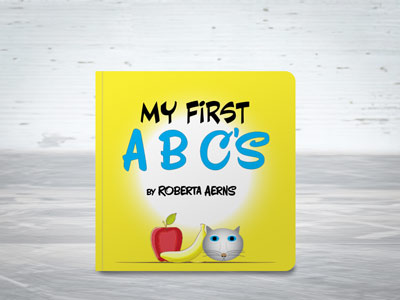
Square formats are particularly well-suited to children's books. Sizes like 8.5x8.5" feel playful and proportionally balanced, avoiding the tall narrowness of a novel and the wide sprawl of a coffee table book.
Square sizes also photograph beautifully for social media and online storefronts, which helps when you're marketing your book.
From a cost standpoint, square sizes tend to be affordable sweet spots with most printing companies. Non-standard or very large formats can drive up per-unit costs significantly, so if budget is a consideration, square is a smart choice that doesn't sacrifice any charm.
Make the Title Stand Out
Your title is the first thing a child (and their parent) sees. It needs to be bold, readable, and visually exciting. Choose a font that has personality but remains easily legible, and make sure it contrasts strongly against the background illustration. Avoid thin or overly decorative lettering that gets lost in a busy image. A good guideline is: if you can't read the title clearly in a thumbnail-sized preview, it needs more contrast or a larger size.
Since it's part of the cover design, designing an effective title is another area that an illustrator should be able to help you with.
Typography Inside the Book
Unlike the title on your cover page, simplicity is key for your inner typography. Choose one or two fonts at most — one for the main story text, and maybe one for chapter headings or callouts. Avoid fonts that mimic handwriting or are overly stylized, as these can be genuinely hard for young readers to decode.
Font size matters a great deal depending on your audience. For books aimed at ages 0-6, aim for 18-24pt type.
Early readers (ages 6-9) can handle 14-18pt, and middle grade books typically sit around 11-14pt.
It's also wise to test your layout by printing a sample page; what looks comfortable on screen can feel cramped on paper.
We have some more tips on typography in the 8 Elements of Graphic Design for Printing article.
Setting Up Margins and Bleed
Bleed and margins are the unsung heroes of a well-formatted book. Bleed refers to the extra artwork that extends beyond the trim edge of the page so that colors and images extend to the edge after trimming. This is typically 0.25" on all sides.
Not all books require a bleed though, especially on the inside pages. Depending on your content, leaving at least a 0.25" margin around the edges may be fine (and generally saves you some money).
Margins, on the other hand, define the safe zone where your text and important illustration details should live. Keep all critical content at least 0.25" inside the trim edge, plus an additional 0.25" near the gutter (the inside edge where pages meet the spine). Elements placed too close to the gutter can get swallowed in the binding and become difficult to see or read.
When working on two-page spreads, plan your illustration with the gutter in mind. Avoid placing a character's face or a key story moment right at the center fold.
Paper and Binding Options
Paper Considerations:
The look and feel of a children's book is part of the experience. For standard picture books, a gloss or smooth-coated interior paper makes colors pop and holds up well to repeated reading.
For cover paper, 80# or 100# Cover with a gloss or smooth finish are good choices to protect the book and give it a polished, professional appearance.
For additional rigidity and durability, consider laminating your covers (or all pages). This is especially useful to avoid tearing and spills with younger age groups.
Read more about paper stocks here.
Binding Considerations:
Choosing the appropriate book binding methods depends on things like your book's length and intended audience:
- Saddle stitch binding (stapled) works well for shorter books under 48 pages.
- Perfect binding (glued into the spine) is better for longer formats.
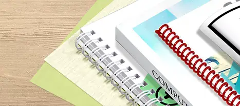
- Spiral binding is the most durable, often the most affordable, and offers a variety of binding colors.
You can read in-depth comparisons of common binding options here:
Corner Rounding:
Many children's books have rounded corners on the outside edges. This adds a pleasing visual aftertouch to your books' presentation while helping avoid corner denting, dog-earing, and accidental pokes from the sharp corners of the paper.
Preparing Your Files for Print
When your design is complete, export your interior pages and cover as separate PDF files. Use PDF/X-1a or PDF/X-4 format, with all fonts embedded or outlined and images at a minimum of 300 DPI. Set your color mode to CMYK. RGB files can shift unexpectedly when converted for print, and the difference can be dramatic on a color-rich children's book.
Double-check that your bleed is included in the export and that crop marks are turned off unless your printer specifically requests them.
For your cover, the exact page setup depends on what kind of binding you select. For perfect bound books, your printer's website should have a cover design guide and spine width calculator based on your page count and paper choice.
For other binding types, it's usually best to export the cover pages as individual pages (not as spreads).
Finally, it's usually a good idea to order a physical proof copy before approving your full print run. Colors on screen rarely match print exactly, and a proof gives you the chance to catch any layout surprises before they multiply.


 Processing...