
8 Elements of Graphic Design for Printing
Create captivating designs for your print collateral by observing these time-tested principles.
Depending who you believe, there are anywhere from 7 to 12 principles of graphic design. Regardless of how many steps or concepts you break them into, the same basic elements of layout and design need to be observed if you want your piece to have its intended effect.
Following the principles outlined below will ensure that your piece gets noticed, whether you're designing a flyer, a postcard, or a magazine cover.
- Balance
- Hierarchy & Proximity
- Alignment
- Contrast
- Repetition
- Proportion
- White Space
- Typography
- Comic Sans
- Papyrus
- Arial

Visual balance can be achieved by arranging elements symmetrically or asymmetrically, experimenting with parallel and perpdendicular alignments, embracing negative space, vanishing points, and more. It's all about finding that sweet spot where everything feels stable and harmonious.
Another important aspect of balance that is often overlooked is the color palette. Using the right color schemes, temperatures, and harmonies for your printed design can make the difference between looking professional and looking pitiful. Learn and utilize some basic color theory if you want to design a colorful printed piece that gets noticed, picked up, and read instead of ignored or thrown away.

"Rule of Thirds" is a principle of composition in photography that can be used effectively with graphic design in general. This image shows a great use of the rule of thirds. The visual weight of the image is divided roughly into 3 parts. The color overlay in the second image shows the separation lines while also demonstrating a simple use of color harmonies, which gives even more overall balance to the image.
Next, we have hierarchy, and the closely related proximity. Hierarchy refers to the visual flow of content, specifically what grabs the most attention and what information is most important. You have limited time and space to hook your audience and tell them what they need to know. Make sure they don't have to go on a treasure hunt to find the "5 W's" — Who, What, Where, When, and Why.


Proximity is about bringing related items closer to each other. By doing so, you establish a connection between them and make it easier for people to navigate and understand the information you're presenting.
For example, say you're designing a poster for a concert at a local venue. If it's a 21+ show, don't hide that in the corner. Establish this prominently right next to the other vital information, such as the date, time, price and location.
This poster design, if a little cliche, shows this concept in its ideal form. The who and what are established right away: a band called Abraxia is playing an eclectic mix of retro tunes. In the bottom 1/4 of the design, everything else we need to know is clearly delineated: the date/time, the age minimum, the price and the venue.
Alignment is another crucial principle of print design. This is about giving your elements a sense of order by positioning them in relation to a reference point or along a common axis. Proper alignment can work wonders in terms of creating a cohesive and organized design. For example, be attentive to the space created between lines of text (called the lead), especially when changing font sizes within a text block.
Look at the differences in alignment between these two business card mockups:

BAD: The name is in the top right, the title is smack dab in the middle, and the contact information looks like it got hit with a tornado. All play and no work makes Jack's business card a dull, ugly design.

GOOD: Jack's name is at the top of the visual hierarchy, with his title and contact information neatly aligned and ordered below. Jack jumped over the candlestick and got a great business card.
BAD: The name is in the top right, the title is smack dab in the middle, and the contact information looks like it got hit with a tornado. All play and no work makes Jack's business card a dull, ugly design.
GOOD: Jack's name is at the top of the visual hierarchy, with his title and contact information neatly aligned and ordered below. Jack jumped over the candlestick and got a great business card.
The principle of contrast is all about embracing differences. Whether it's through color, size, shape, or texture, contrast helps you create emphasis and visual interest. It's like turning up the volume on the elements you want to stand out.
Courtesy of Wikipedia
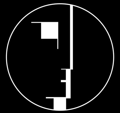
This German interdiscplinary art movement is known for its simple and often abstract geometric shapes, lines and angles, lack of ornamentation, and functional architectural designs. Schlemmer is so inseparably linked with this design style that the English post-punk band of the same name adopted the head for their t-shirts, album art and other memorabilia. If you've seen this design before, unless you're a frequent visitor of modern art museums, it was probably on a Bauhaus t-shirt.

Old classics die hard, and it's hard to tell if the Oskar Schlemmer head was adapted, adopted, or merely a source of inspiration for this popular electronics logo:
Notice the similarities in the logo for LG Electronics — although coincidence is always a possibility.
The effective use of a two-tone color scheme enhances the contrast, making the image virtually pop out at you. Try experimenting with some shapes, lines, minimal color palettes and even some subtle shading and texturing to see what you can come up with. For example, notice the simple blue-to-black gradient used here, and how it creates a sense of 3D realism:
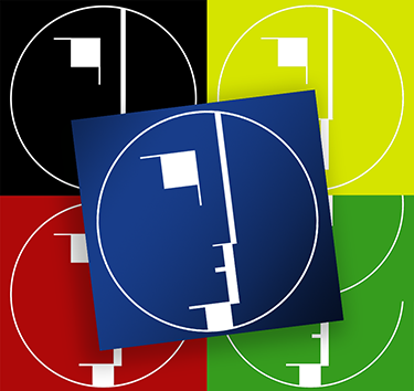
Simple, subtle embellishments like this can take a decent design from "meh" to "marvelous."
Repetition is all about consistency and familiarity. By repeating colors, shapes, patterns, or any other design element, you create a sense of unity throughout your printed piece. It's like giving your composition its own unique identity and brand.


While this postcard design showcases a very obvious kind of repetition scheme with the green alliterated letters, this entire article displays a more subtle use of repetition: the custom styled red numbers before each entry in the list. Repetition can be used overtly or subtly to tie all your content together and create a consistent, structured print piece that communicates your message clearly and effectively.
Proportion is all about size and scale. It's about finding that perfect balance between different elements so they all fit together harmoniously. Proportion helps create hierarchy and a pleasing visual experience. Should that photo be large or small? Is the text too big? Does advertising content dwarf the surrounding information? Finding the right answer to questions like these will help make your design a winner.
Ah, white space. It's like a breath of fresh air. White space, also known as negative space, refers to the empty areas in a design. It's not just about leaving things blank; it's about using that space strategically to enhance readability, focus, and overall aesthetics. Less can definitely be more!
White space can play into the theme of your message or design, too. Take for example this minimal postcard design for a local spa:

Last but not least, we have typography. It's the art of choosing, arranging, and styling typefaces. Selecting the right fonts, sizes, spacing, and formatting can make a world of difference in terms of readability and setting the right tone for your printed designs and marketing collateral.
Don't make anything hard to read. Stick to non-scripted fonts, unless it's used very minimally for effect, such as a header saying "Congratulations." Font sizes should generally be at least 11-pt or larger to ensure your text content IS readable for people of all ages and eye conditions. Decorative fonts, effects, and varying font styles (bold, italic, normal, etc.) should be used very minimally, and only with specific purpose, if at all.
You might think you've chosen a great font that fits your theme or message, but not everyone feels the same. For example, some fonts are overused and should be avoided completely. Among the worst offenders are:

Not just overused but unprofessional and childish, this "classic" makes the top of most people's lists for good reason. It was cute when we were kids drawing doodles in MS Paint, but let's leave it in the '90s where it belongs.

This art-deco styled font has been used to death as well. As much as it may seem to fit perfectly with some themes (restaurants come to mind), anyone with an eye for design will greet this uninspired stylistic choice with a resounding yawn.

Any list of overused fonts is bound to cause some controversy, and this one is especially problematic since there's a good chance you're reading this page partly rendered in the Arial font right now.
Arial was the default font on Microsoft computers for a long time, which makes it familiar to the point of boring if you're trying to grab attention with a printed design. But in some cases, tried-and-true (albeit overused) fonts like Arial, Helvetica, and Times New Roman still serve a purpose.
This is especially true with websites. Because you never know what font limitations your viewers may have on their devices, defaulting to a common font is a wise choice. But for print designs, you can probably find comparable alternatives that don't make the most-hated fonts lists.
Just don't forget to embed your fonts or create outlines, particularly if it's an odd or uncommon font.
If this seems overwhelming, don't be discouraged. Not every item on this list is going to play a major role in every design you create. But if you build your print layout around several of these principles while keeping the others in mind, this will help you design eye-popping print materials that turn heads, make lasting impressions and grow your business.
 Processing...


